Figure failures (and successes!)
21 Jan 2020 Tags: Course designWell-designed figures are invaluable for presenting technical detail, including architectural diagrams, timing diagrams, data visualizations, category hierarchies, and many other forms. Yet the simplicity and directness of a successful figure belies the complexity of all the design decisions underlying it. Those decisions were specific to the original context. Pulling a figure from that context and inserting it into a very different context such as lecture slides will likely fail. This short post lists the many ways that such appropriation can fail.
The context: Preparing a talk
The need is common, the situation urgent: I am preparing a lecture on a slippery, abstract concept. A figure’s just the thing for giving my audience an overview. But there’s so little time! Preparing a figure from scratch will take too long.
No problem. There’s an enormous library of figures on the Internet already. Just grab the closest one, drop it at the appropriate point in the lecture. Problem solved, right?
Unfortunately, it’s not nearly that simple. A figure that was entirely adequate in one context may fail when imported into the context of a lecture.
The problems: Figure failures
Some ways that figures can fail:
- Poor representation of material
- Poor original design
- Simply wrong
- Poor readability
- Too small fonts or features
- Insufficient contrast
- Poor resolution
- Too large for display
- Unsuited to this context
- Too much detail
- Wrong focus, aim, goal for this purpose
- Inconsistent with rest of presentation or course
- Inconsistent notation
- Inconsistent visual style
- Different definition of terms or concepts
- Different analytic perspective
- Legally or ethically inappropriate
- Copyright misuse / ownership / difficulty of attribution
Of course, all these problems could also occur in figures created expressly for the current presentation, particularly issues of representation and readability. Representing concepts in a figure is hard, requiring a multitude of choices whose implications might not be apparent when they were originally made. Few instructors have training in graphic design methods and tools and they often have to create course material in very little time. Maintaining consistency from class to class and week to week is particularly hard.
Yet all those problems also arise when choosing a previously-created figure and are compounded by the additional issues of context, consistency, and ethics.
No easy solutions
I see no ready solutions to this dilemma but I think it is beneficial to bear these limitations in mind. A figure appropriated from a different context may introduce more confusion than clarity in the audience. An image that is insufficiently readable may just be a waste of time and bore the audience. Be alert to the risks and only use an appropriated figure when the benefits likely exceed the risks.
Simple, hand-drawn figures, photographed with a phone or digitized some other way, may be superior to a more visually polished figure from another context that risks diluting your message. I am seeing an increase of hand-drawn figures in presentations, such as the slide figures of Daniel Smith:
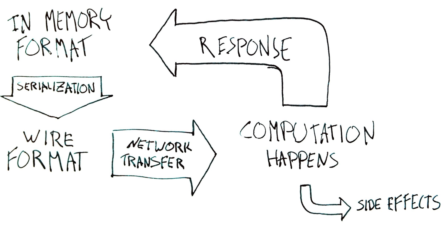
—Slide 17 from Kubernetes-style APIs of the Future, Daniel Smith,
Kubecon 2018.
Note how simple Smith’s slide is.
The increased use of hand-drawn figures has lead in turn to the use of machine-rendered figures and fonts that appear hand-drawn. For example, this figure from DataDog’s post on tagged metrics
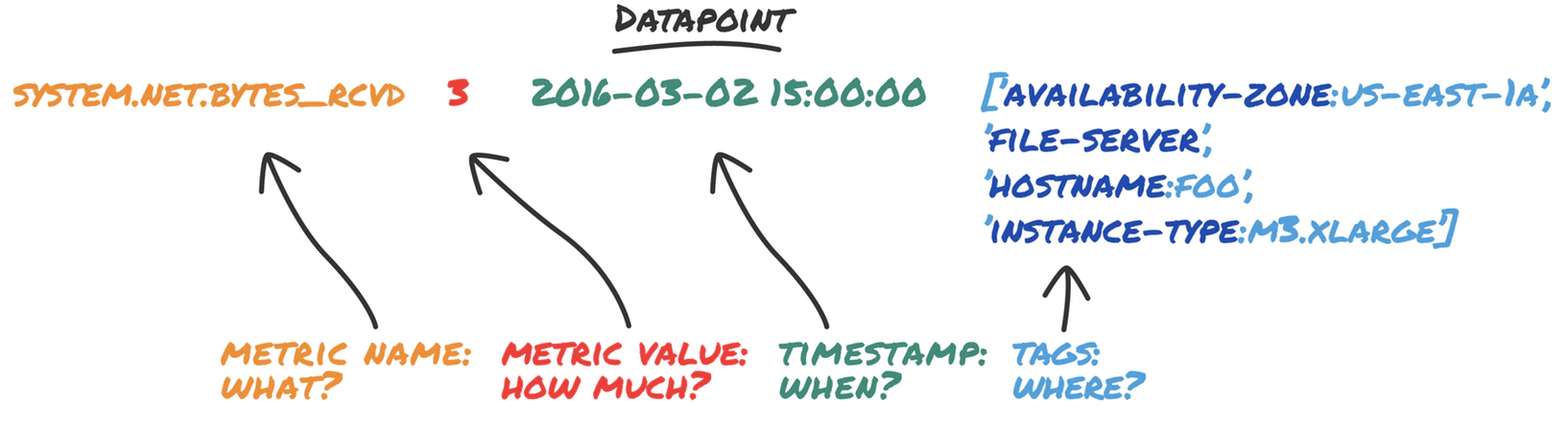
appears hand-drawn but if you compare occurrences of the same glyph, such as ‘M’ or ‘A’, they are identical. It is a machine-rendered font designed with a hand-drawn esthetic. This is fine in its own context but it has the paradoxical effect of making actual hand-drawn figures appear less attractive because they cannot match the regularity of their machine-drawn cousins.
An example of good figure design
I’ll end this post with a shout-out to a shining example of the benefit of figures drawn expressly to compare and organize the concepts of an entire book. Tamara Munzner’s principles of visualization design in Visualization Analysis and Design are organized and illustrated by a marvellous sequence of figures by Eamonn Maguire. For example, Chapter 3 is introduced by this visual table:
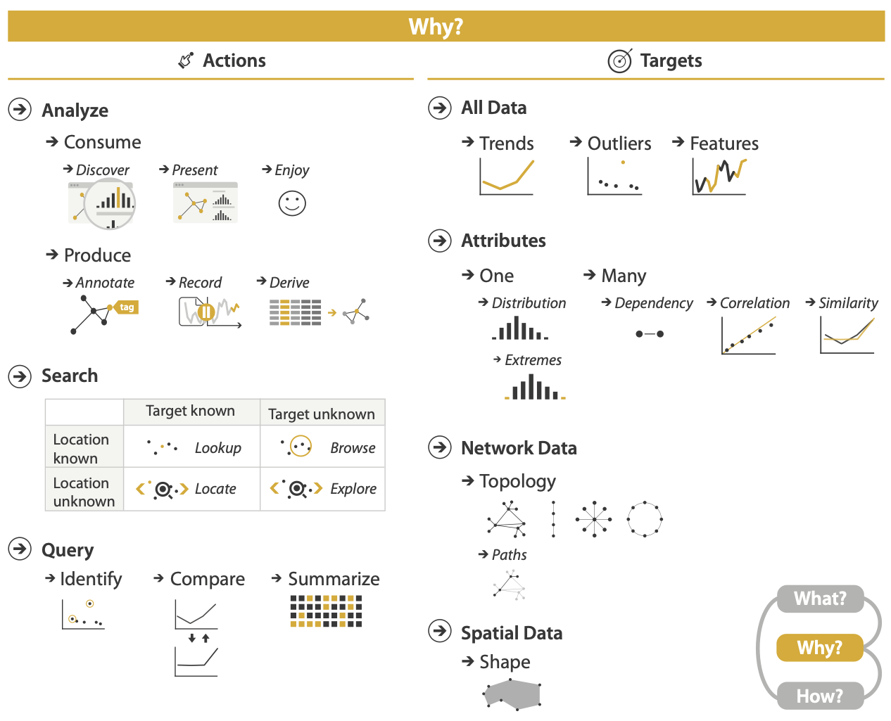
—Fig. 3.1 from Visualization Analysis and
Design. Tamara Munzner, with illustrations by Eamonn Maguire. A K
Peters Visualization Series, CRC Press, 2014. Figure CC BY 4.0 license.
Maguire’s figures develop a consistent visual language for the entire book and her figures brilliantly illustrate Munzner’s ideas without extraneous detail. Maguire’s name is deservedly on the book’s cover.
Unfortunately, most of us have neither the resources to hire an excellent illustrator nor Maguire’s skill to do it ourselves. Nonetheless, I return to this example again and again for inspiration of how powerful purpose-built figures can be. Even if I never match this quality, or never even come close, it is worth aiming for.